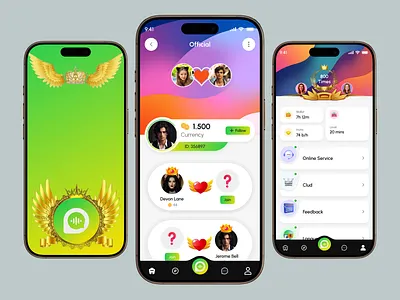
How Small Design Details Can Make a Big Visual Impact
Great design is often associated with bold colors, striking images, and impressive layouts. However, some of the most effective visual improvements come from much smaller decisions. A slight adjustment to spacing, a carefully chosen font, or a subtle change in color can completely alter how a design feels.
These details may seem minor when considered individually, but they work together to create a polished and intentional result. Whether you are designing social media graphics, presentations, websites, advertisements, or marketing materials, paying attention to the little things can make your work easier to understand and more enjoyable to view.
Start With Thoughtful Spacing
Spacing is one of the easiest design details to overlook. When elements are placed too close together, a design can feel crowded and difficult to read. Giving text, images, and other components enough room creates a cleaner visual structure.
Give Important Elements Room to Breathe
Consider a promotional graphic with a headline, product image, description, and call to action. If every element is packed tightly together, viewers may struggle to identify the main message. Increasing the space between sections can immediately make the design feel more organized.
Whitespace does not mean that an area has to be completely empty. It simply provides enough visual separation for individual elements to be recognized. Even a few extra pixels around a button or headline can improve the overall balance of a layout.
Pay Attention to Typography
Typography has a powerful influence on how people experience a design. Two designs can contain exactly the same words but feel completely different because of their font choices, sizes, and spacing.
Choose fonts that match the purpose of your project. A modern sans-serif font might work well for a technology company, while a more decorative typeface could suit an event invitation or creative campaign.
Adjust Line and Letter Spacing
Small changes to line height and letter spacing can also improve readability. Text that is tightly packed can feel overwhelming, while excessive spacing can make related words appear disconnected.
For example, increasing the line height of a paragraph can make a website section easier to scan. Slightly increasing letter spacing in a short heading can also give it a more refined appearance.
Use Color Accents Strategically
A design does not need many colors to stand out. In fact, using too many competing colors can weaken the visual hierarchy. A carefully chosen accent color can have a much stronger effect.
Imagine a mostly neutral website with one bright color used for buttons, links, and important icons. Because the accent appears in limited places, those elements naturally attract attention.
The same principle can be applied to social media graphics and presentations. Rather than making every element colorful, use color to direct the viewer toward the information that matters most.
Refine Borders, Shadows, and Shapes
Small decorative details can add depth and structure when they are used carefully. Borders can separate sections, rounded corners can soften a layout, and subtle shadows can help an element stand out from its background.
The key is restraint. A heavy shadow around every object can make a design feel dated or cluttered. A softer effect used only on an important card or button can create a more polished appearance.
Use Details to Support the Layout
Decorative elements should have a purpose. For example, a thin line might separate a headline from supporting information, while a subtle background shape could draw attention toward a featured product.
Before adding an effect, ask whether it improves clarity or simply fills empty space. If removing the element makes the design cleaner without reducing its effectiveness, it may not be necessary.
Experiment With Text Treatments
Text can become a visual element rather than simply a way to communicate information. Subtle changes to a headline can make it more memorable while helping establish a distinctive design style.
For designers who want to explore creative typography, AI text effects can provide different treatments for words and headlines, making it easier to experiment with styles before settling on a final direction.
These effects work best when they remain connected to the overall design. A dramatic treatment may be appropriate for a music poster, while a simple shadow or gradient might work better for a business presentation.
Improve Image Placement
The position of an image can influence how balanced a design feels. Even a high-quality photograph can look awkward if it is placed without considering the surrounding elements.
Pay attention to where the subject of an image is facing or looking. If a person is looking toward the right side of a photograph, leaving space in that direction can create a more natural composition. Similarly, a product image may work better when there is enough surrounding space for accompanying text.
Avoid Unnecessary Cropping
Cropping is another small decision that can have a major impact. Cutting too close to important details can make an image feel uncomfortable, while excessive empty space can reduce its visual impact.
Try several crop variations and compare how each one interacts with the rest of the layout. Sometimes a slightly different crop can make the entire composition feel more balanced.
Create Consistent Alignment
Alignment gives a design an underlying structure. When headings, images, buttons, and paragraphs line up naturally, the design feels more organized even if the viewer cannot explain why.
Choose a basic alignment system and follow it throughout the layout. For example, several sections might share the same left edge, while selected elements are centered for emphasis.
Inconsistent alignment can make even attractive individual elements feel disconnected. Taking a few moments to check the edges and spacing between components can make the final result noticeably more polished.
Add Small Brand Elements
Branding does not always need to be obvious. Small recurring details can help create recognition without overpowering the main content.
These details might include a particular icon style, a subtle color combination, a recurring shape, or a consistent way of presenting headings. Over time, these choices can become part of a recognizable visual language.
For example, a social media account might consistently use a small colored line beneath every headline. It is a simple detail, but repeated use can help followers identify the account’s content while scrolling.
Review the Design at Different Sizes
A design can look excellent when viewed closely but lose its impact when displayed at a smaller size. This is particularly important for social media graphics, website elements, and advertisements that may be viewed on different screens.
Zoom out and check whether the main message remains clear. If the headline disappears or small details become distracting, the design may need adjustment.
It is also helpful to view the design on an actual mobile device when possible. This can reveal readability and spacing issues that are difficult to notice on a large monitor.
Conclusion
Small design decisions can have a surprisingly large effect on the final visual experience. Thoughtful spacing, typography, color, alignment, image placement, and subtle decorative details can turn an ordinary design into something more polished and memorable. By paying attention to these details and refining them with intention, you can create visuals that communicate clearly while leaving a stronger impression.